Visual Identity DesignGlow Nourish Skin Oils
The Brand
Glow Nourish is a skin oils brand built around one thing, radiance, distilled into every drop. Slow, intentional, and impossible to rush. The kind of ritual that doesn't need an occasion to feel like self-care.
The Objective
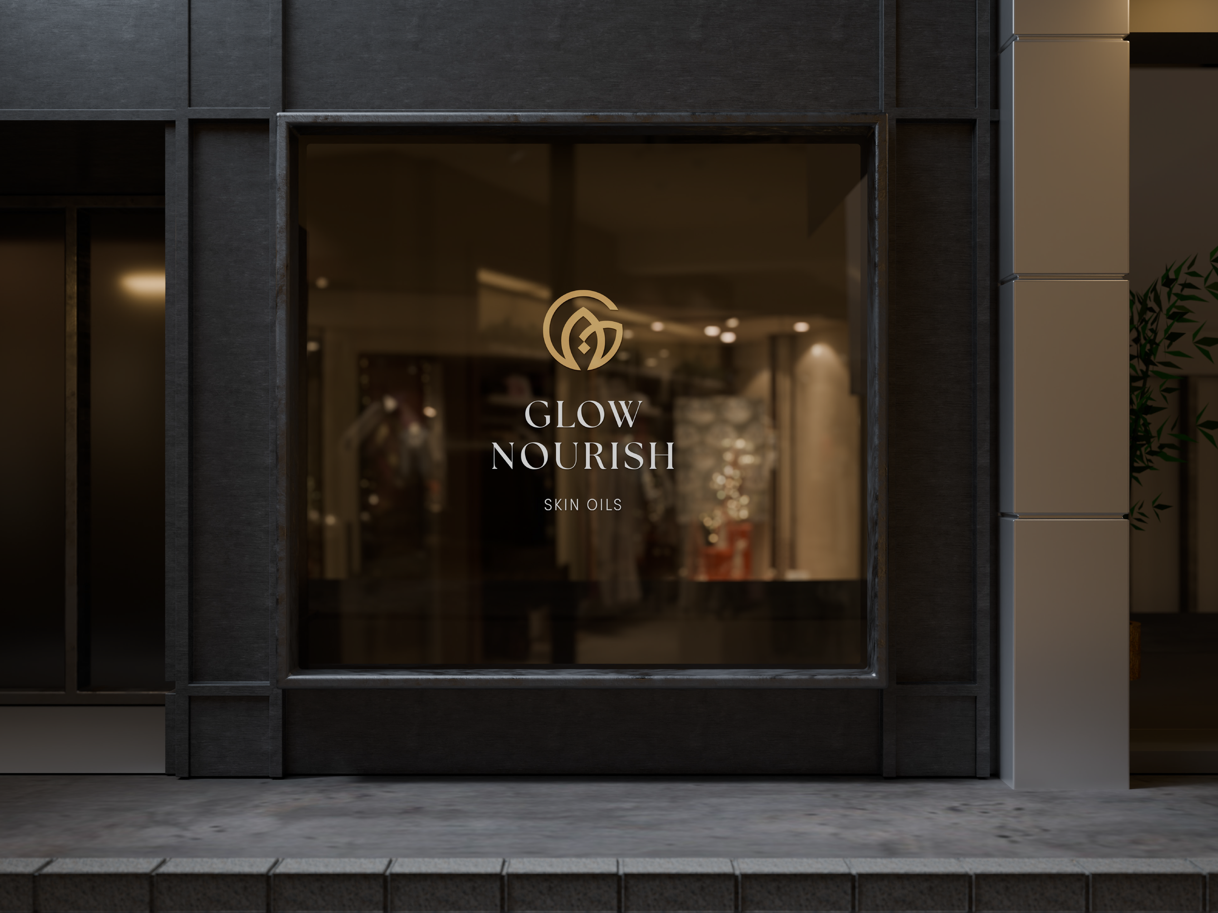
Glow Nourish needed an identity that matched the quiet luxury of the product itself. Warm but not soft. Refined enough to feel elevated, clear enough to work everywhere, from a dropper bottle label to a storefront window.
The Solution
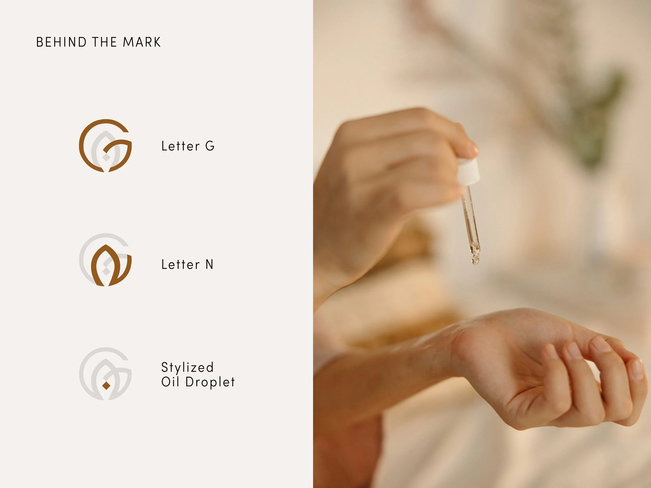
The mark was born from the two letters at the heart of the brand G and N woven into a single circular emblem, with a stylized oil droplet at its core. Three elements, one seamless form. A symbol that carries the whole spirit of the brand: natural, precious, and purposeful.
Liquid gold and warm amber hold the system together. Rich enough to feel luxurious. Organic enough to feel real. A palette that travels across packaging, storefronts, and social without losing what makes Glow Nourish feel like Glow Nourish.