Visual Identity DesignCone Foods
The Brand
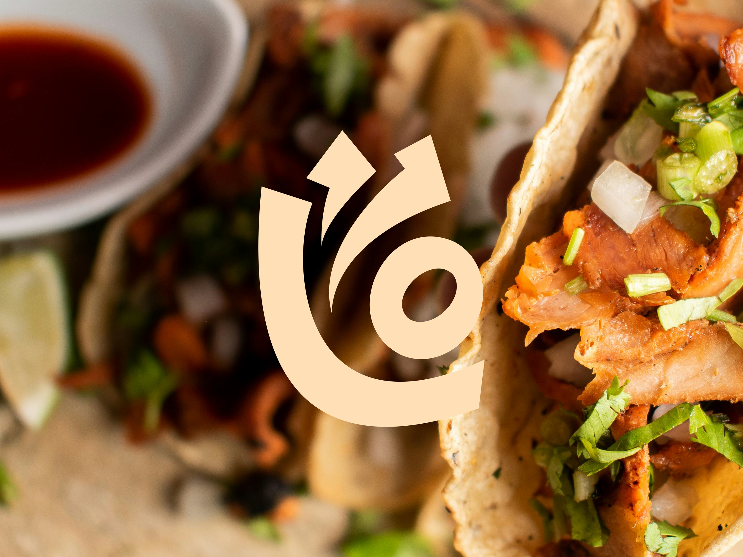
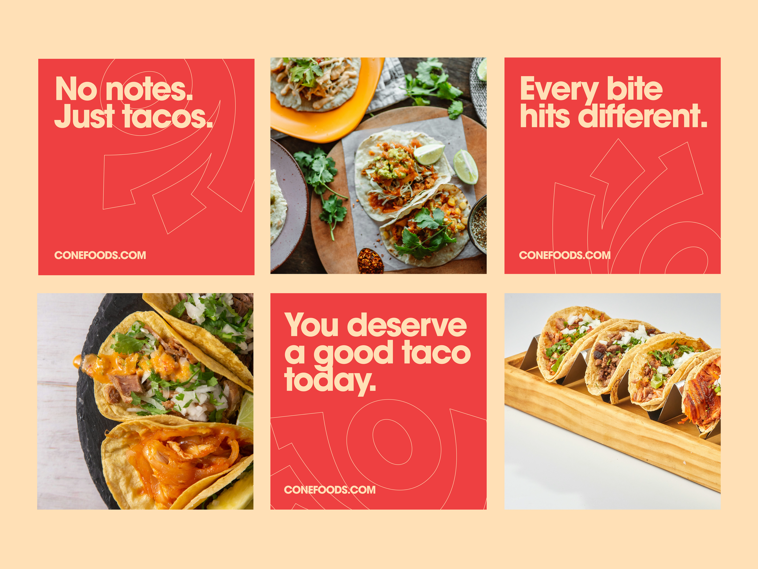
Cone is a taco brand built around one thing, bold flavor, in your hand, right now. Fresh, fast, and impossible to ignore. The kind of eat that doesn't need a sit-down to feel special.
The Objective
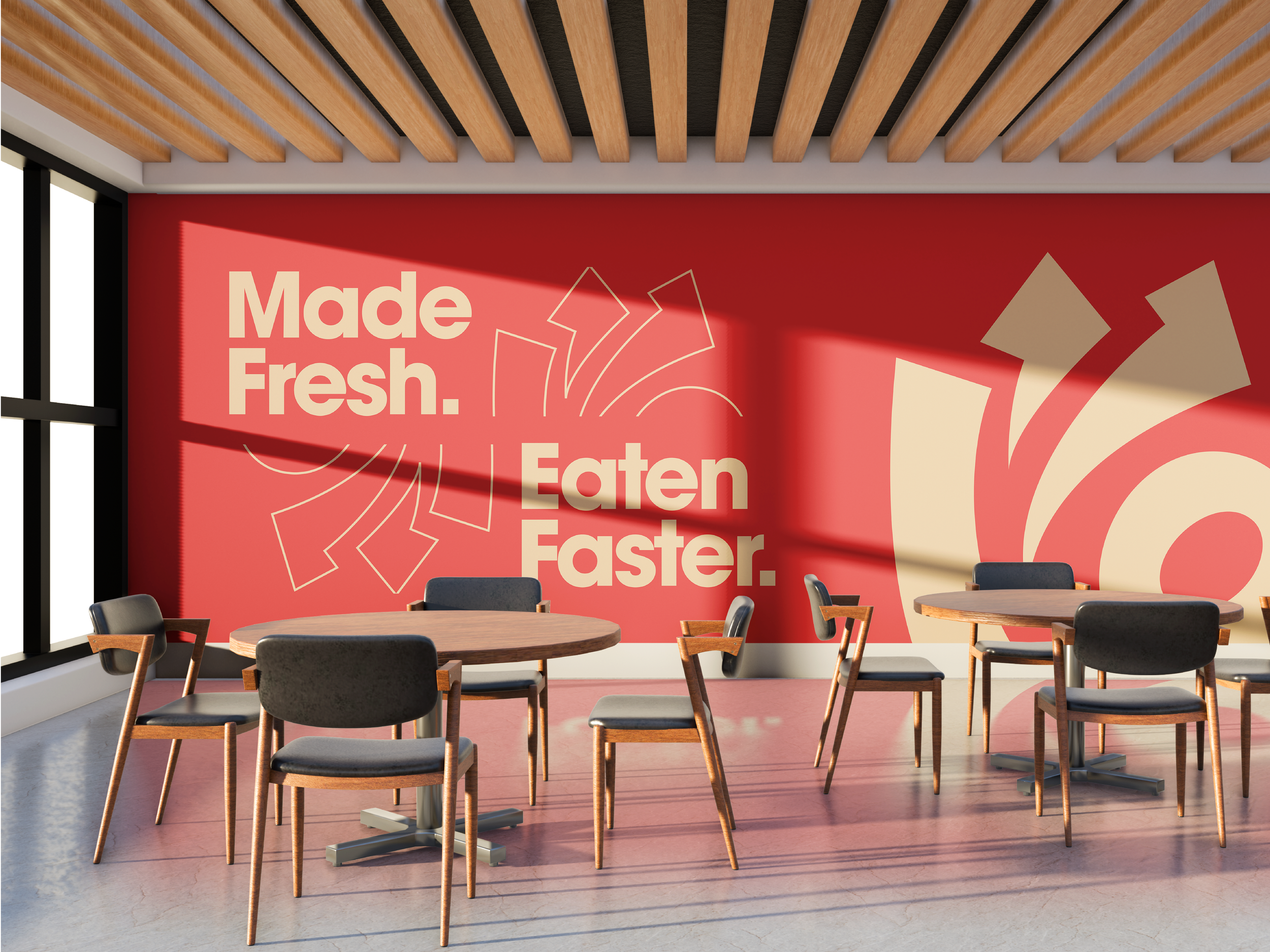
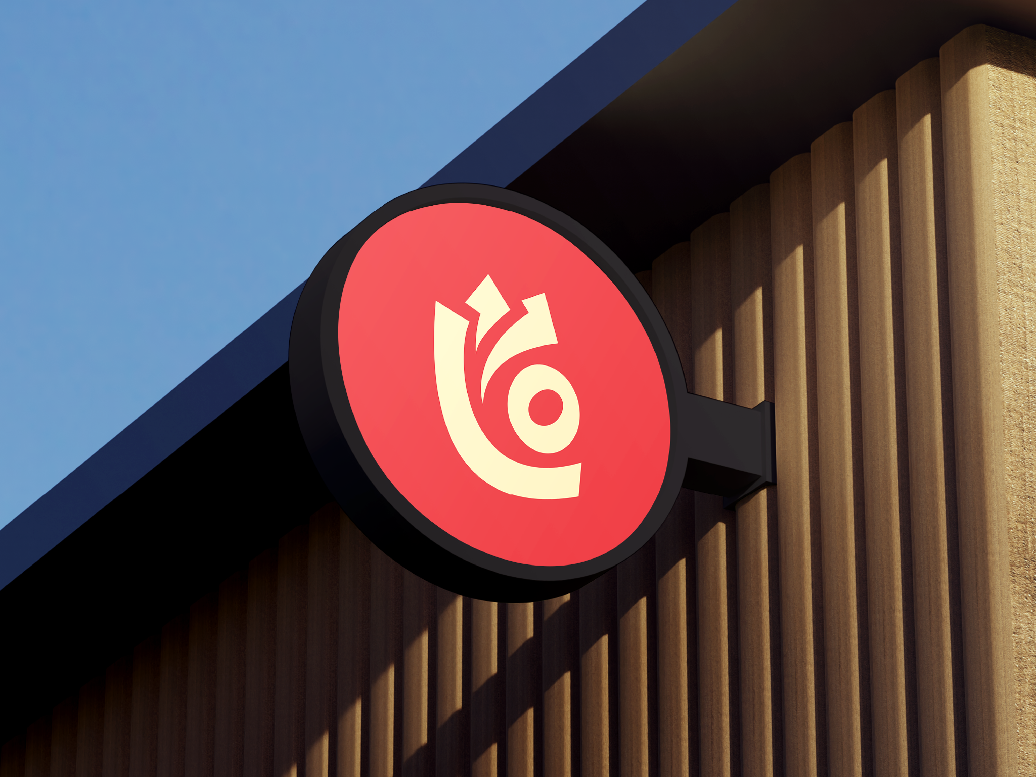
Cone needed an identity that matched the energy of the food itself. Approachable but not forgettable. Bold enough to turn heads, clear enough to work everywhere, from a paper wrapper to a storefront sign.
The Solution
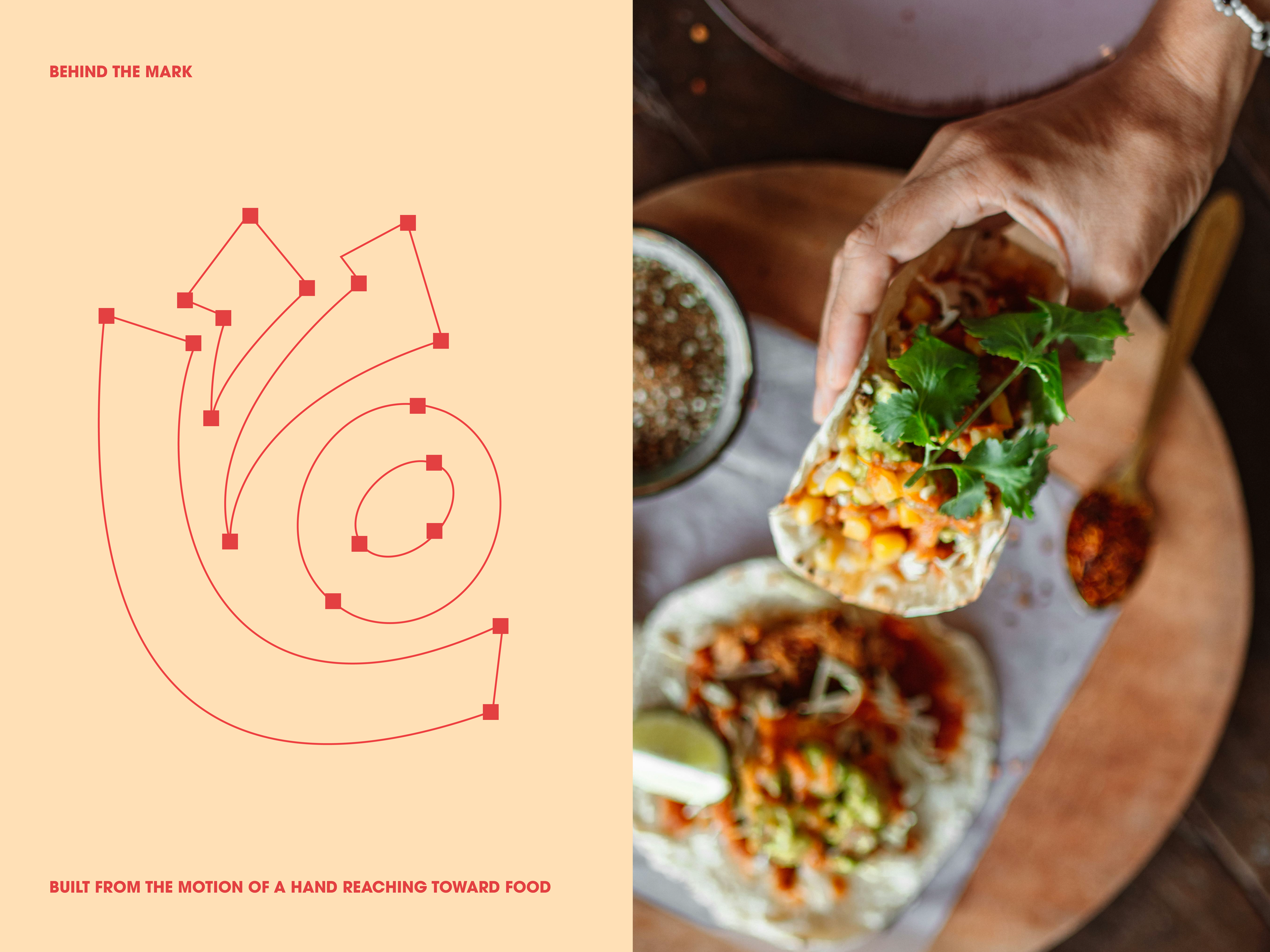
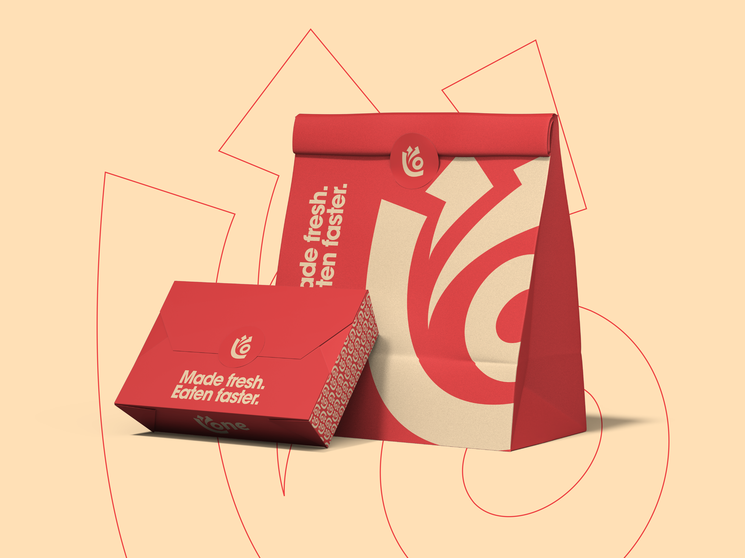
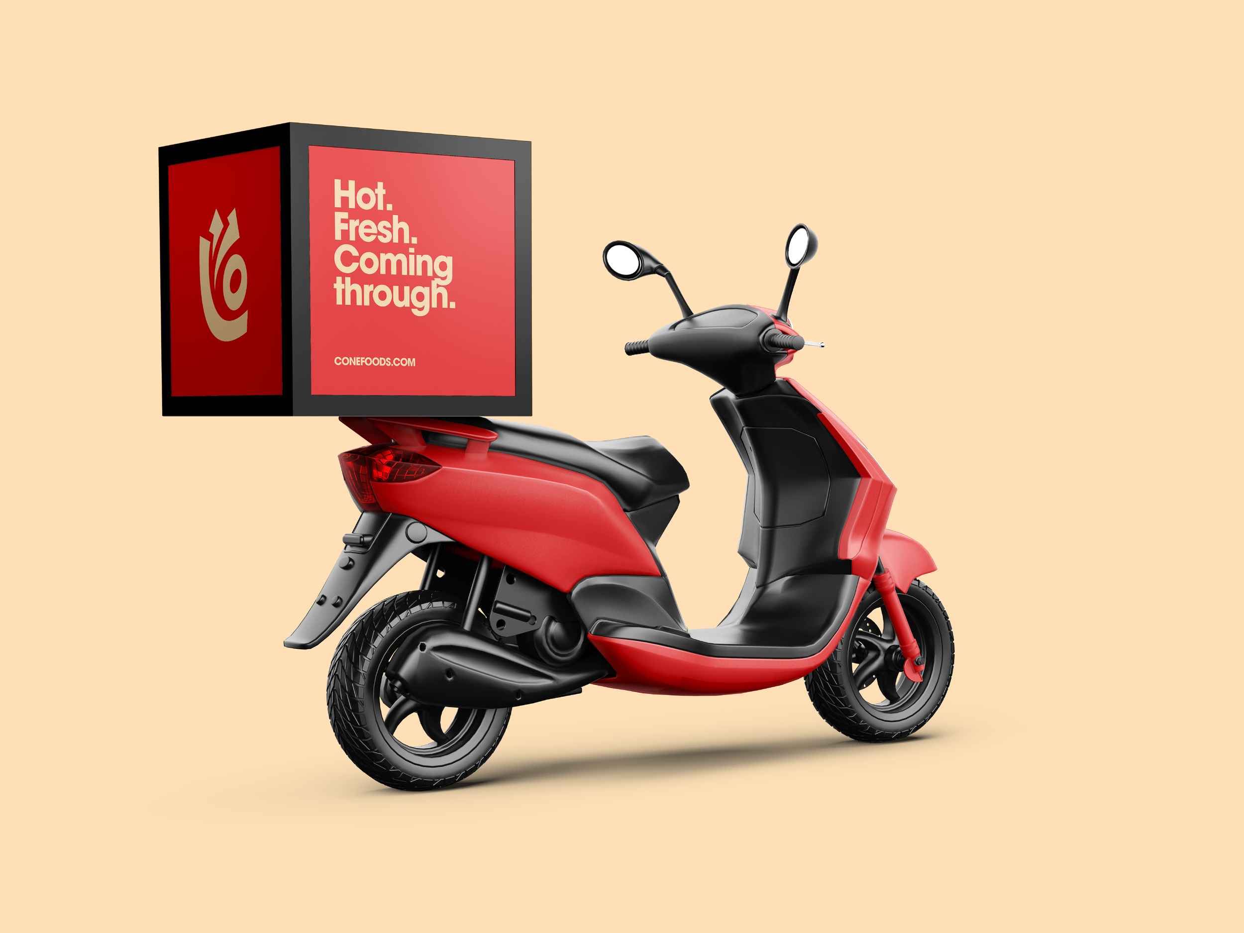
The mark came from the most instinctive moment of the experience, the reach. A hand grabbing something good, abstracted into the "O" at the center of the name. One shape that carries the whole spirit of the brand. Coral-red and warm cream hold the system together. Warm enough to feel handmade. Bold enough to feel alive. A palette that travels across packaging, storefronts, and social without losing what makes Cone feel like Cone.